
YouTube Thumbnail Design Principles: Complete 2026 Guide
You’ve made a good video. The edit works, the topic is useful, and viewers who find it often watch most of it. Yet the upload is stuck because barely anyone clicks.
That’s usually a packaging problem.
Your YouTube thumbnail design has one job before anything else: make the right viewer stop, understand the promise, and want the missing piece. It doesn’t need to explain the entire video. It needs to create enough interest for the title and thumbnail to work together.
This guide focuses on the design principles that still matter in 2026, the ones that generic advice usually skips. You’ll get practical rules for composition, colour, text, faces, curiosity, mobile viewing, testing and platform-specific covers for YouTube, TikTok and Instagram Reels.
This is a design principles guide, not another list of vague “use bright colours” tips. For a broader step-by-step workflow, see our guide to making a YouTube thumbnail that gets clicks.
What makes a YouTube thumbnail effective in 2026?
A strong thumbnail communicates three things almost instantly:
- What the video is about
- Why the viewer should care
- What they still need to discover by clicking
The best thumbnails are not miniature summaries. They are visual promises.
A thumbnail showing a laptop, a desk and the words “YouTube Setup Guide” may be accurate, but it has no tension. A thumbnail showing a creator surrounded by a messy desk, one broken monitor and the words “I Ruined Everything” creates a question.
What happened? Can it be fixed? Would this happen to me?
That question is the click.
YouTube itself recommends keeping thumbnails clear, readable and not overly complex. It also says that 90% of its best-performing videos use custom thumbnails. (support.google.com)
A good thumbnail doesn’t tell the whole story. It gives the viewer a reason to need the rest of it.
The 2026 YouTube CTR benchmark
There is no universal “good CTR”. A search result, a Home recommendation and a notification are not equal sources of traffic, so comparing their CTRs directly can lead you to redesign a thumbnail that is already doing its job.
YouTube explains that CTR often falls as a video reaches more people outside its core audience. A video might begin at 9% CTR with loyal viewers, then settle at 3.5% after reaching ten times more impressions. That drop can represent growth, not failure. (support.google.com)
Third-party 2026 benchmarks generally place broad YouTube CTR somewhere between 2% and 10%, with many channels reporting average results around 3% to 4%, and strong performance often sitting around 5% to 7%. Treat these as directional ranges, not platform-wide rules. (vidiq.com)
YouTube situation | Useful CTR range | How to interpret it |
|---|---|---|
Broad Home recommendations | 2% to 6% | High impressions often mean lower intent |
Suggested videos | 3% to 7% | Depends heavily on the videos surrounding yours |
YouTube Search | 4% to 10% | Searchers often have stronger intent |
Loyal subscribers | 6% to 12% | Your audience already recognises and trusts you |
Early launch period | Often inflated | Core viewers see the video first |
Niche or very small audience | Can exceed 10% | High CTR may still come from a limited impression pool |
Use your own channel as the main benchmark. Compare videos with similar traffic sources, audience size and subject matter. YouTube recommends looking at CTR on Home and Suggested during the first 24 hours for general audiences, particularly on videos with above-average impressions. (support.google.com)
A high CTR alone is not enough. If the thumbnail promises a dramatic transformation and the video takes eight minutes to get there, viewers may click but leave quickly. YouTube’s Test & Compare system evaluates thumbnails using watch time share, not just clicks, because the winning thumbnail should attract viewers who actually watch. (support.google.com)
Principle 1: Build one visual idea
The biggest thumbnail mistake is trying to show everything.
Creators add the presenter, the product, three screenshots, a before-and-after, a logo, a graph, four text labels and several arrows. The finished image may contain all the information, but viewers can’t process it while scrolling.
Give the thumbnail one dominant idea.
For a video titled “I Tested 12 AI Video Editors”, possible thumbnail concepts include:
- One creator holding two competing editing apps
- A timeline exploding with a red warning symbol
- A clear before-and-after showing raw footage beside the final edit
- One “winner” badge beside a row of blurred alternatives
Don’t combine all four. Pick one.
Use the three-element test
A useful working limit is:
- One focal subject
- One context or tension element
- One text element, if needed
For example:
- Focal subject: your face looking worried
- Context: a laptop showing a failed export
- Text: “8 HOURS LOST”
That is enough to create a story.
This does not mean every successful thumbnail must contain exactly three objects. Some excellent thumbnails have one object and no text. Others need a chart, map or product lineup. The point is to make every visible element earn its place.
Delete anything that doesn’t improve the promise.
Principle 2: Create a clear focal hierarchy
A viewer should know where to look first, second and third.
If everything is equally bright, sharp and large, nothing has priority. This is why many technically polished thumbnails still feel weak. They have detail, but no direction.
Use a simple hierarchy:
- Primary: the face, object or result that carries the story
- Secondary: the evidence that explains the situation
- Tertiary: small branding, labels or decorative detail
Your primary subject should usually occupy between one-third and one-half of the canvas. That gives it enough size to survive mobile viewing without making the composition feel cramped.
Place the subject where the eye naturally lands
The rule of thirds is useful, but don’t follow it mechanically. Put the main subject slightly off-centre when you need room for text or a second object.
A face looking towards the empty side of the thumbnail creates visual movement. A product pointing towards the headline can connect the image and words. A subject looking out of the frame can create distance and mystery.
But don’t force every face onto a thirds intersection. If the expression or object looks stronger in the centre, use the centre.
The principle is hierarchy, not decoration.
Principle 3: Design for 1280x720, judge at feed size
The standard working canvas for a YouTube thumbnail is 1280x720, with a 16:9 aspect ratio. YouTube’s current help documentation recommends uploading a large image, with 16:9 remaining the most widely used ratio for players and previews. (support.google.com)
Export in JPG or PNG. Keep the final file within YouTube’s upload limit for the device you’re using. YouTube lists a 2 MB limit for video thumbnails uploaded on mobile and 50 MB on desktop. (support.google.com)
The important design test is not how the image looks at full size. It’s whether the idea survives when the thumbnail is small.
Run the three-second mobile test
Before publishing:
- Shrink the thumbnail until it is roughly the size it will appear in a feed.
- Look at it for three seconds.
- Hide the title.
- Ask what you remember.
- Check whether the focal subject and promise are still obvious.
If you need to zoom in, explain the joke or read the text twice, it fails.
A useful test is to view it at around 168 pixels wide, a common approximate size for YouTube Search previews. At this scale, soft edges, thin fonts and low-contrast details disappear quickly. (ctrpilot.com)
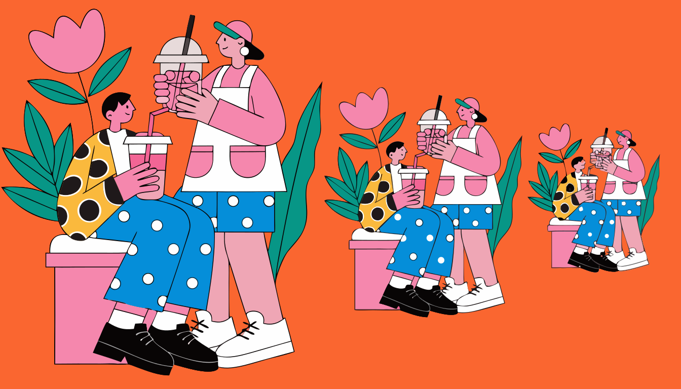
What disappears first?
- Thin outlines
- Small facial expressions
- Detailed screenshots
- Light grey text
- Subtle gradients
- Fine product features
- Logos placed in corners
- Long phrases
Build the thumbnail so the main idea still works after those details vanish.
You can use our thumbnail preview tool to check how a design reads in a feed before you publish it.
Principle 4: Use contrast to win the scroll
Contrast is not just bright colours. It means making the important subject visibly different from its surroundings.
There are four useful types:
- Light and dark: A bright face against a dark background
- Warm and cool: Orange skin tones against blue or teal
- Sharp and soft: A crisp subject against a blurred background
- Large and small: One oversized object next to smaller supporting details
The strongest thumbnails often combine at least two kinds of contrast.
A creator in a bright yellow jacket against a dark blue background is easier to read than the same creator wearing grey in front of a grey wall. A white product on a black background needs less decoration because the contrast does the work.
Don’t confuse saturation with contrast
Making every element neon does not create hierarchy. It creates noise.
Use one dominant colour, one supporting colour and one accent. The accent might be red for danger, green for success or yellow for attention. It doesn’t need to appear everywhere.
A red arrow on a red background is not useful. A red arrow pointing towards a pale object on a dark background can work because the contrast explains the direction.
Stand out from the videos around you
Your thumbnail competes with the surrounding recommendations, not with a blank page.
If every channel in your niche uses red backgrounds and shocked faces, copying that style may make your thumbnail blend in. The goal is not to use the loudest colours available. It is to create a clear visual difference while still fitting the expectations of your audience.
Look at the first page of YouTube Search results for your target topic. Note:
- Dominant background colours
- How many faces appear
- Whether creators use text
- Where the focal subjects sit
- Whether most thumbnails are dark or light
- Which visual idea appears repeatedly
Then choose one way to be recognisably different.
Principle 5: Treat text as a supporting device
Text can clarify a thumbnail, but it should not carry the entire message.
A good rule is one short phrase, usually between one and five words. Examples:
- “NO MORE EDITING”
- “I LOST $10,000”
- “WORST CAMERA?”
- “BEFORE THE UPDATE”
- “IT ACTUALLY WORKS”
The title can provide the detail. The thumbnail should provide the emotional or visual hook.
Don’t repeat the title word for word
If your title is “I Tested 12 AI Video Editors in 2026”, don’t put “I Tested 12 AI Video Editors” on the thumbnail. That wastes the second communication layer.
Better combinations include:
- Title: “I Tested 12 AI Video Editors in 2026”
Thumbnail: “ONE SURVIVED”
- Title: “How I Built a Home Studio for Under £500”
Thumbnail: “£487 TOTAL”
- Title: “The Best Camera Settings for YouTube”
Thumbnail: “STOP USING AUTO”
The title gives context. The thumbnail adds tension, specificity or a result.
Use fewer words than you think
At small sizes, three large words beat eight small ones.
Use:
- A heavy, readable typeface
- Strong contrast against the background
- One text size for the main phrase
- A second size only when absolutely necessary
- Enough padding around the lettering
- A shadow or outline when the background is busy
Avoid placing important text near the bottom-right corner, where YouTube’s video duration label can cover it.
Your thumbnail safe zones guide can help you check where interface overlays are likely to interfere.
Principle 6: Use faces when they add information
Faces work because people notice them quickly, especially when the expression communicates a clear emotional state. YouTube itself recommends considering familiar people for subscriber-focused content and more universal emotions for casual viewers. (support.google.com)
But “add a shocked face” is lazy advice.
A face should explain the story. The expression needs to match the video’s promise:
- Fear for a genuine risk
- Frustration for a failed experiment
- Relief for a difficult result
- Suspicion for a review or investigation
- Concentration for a technical challenge
- Delight for a clear transformation
A neutral face beside a dramatic headline creates a mismatch. So does a huge expression for a calm educational video.
Avoid fake emotion
Viewers have seen thousands of exaggerated reaction faces. If the expression feels disconnected from the video, it can reduce trust.
For an honest review, a raised eyebrow may work better than an open-mouthed scream. For a tutorial, a focused or confident expression may fit better than panic.
The best face is not always the most dramatic face. It’s the face that makes the promise believable.
Use real images whenever possible
A still frame from the video can work if the lighting, pose and expression are strong. Taking a few deliberate thumbnail photos during the shoot gives you more control.
You can also use a tool such as Thumbn’s AI thumbnail maker, which watches your video and generates thumbnail concepts from the footage. AI can help identify useful moments and build variations, but you should still check whether the face, object and promise are faithful to the actual video.
Image models also have limits. They may refuse to generate real, identifiable people, or produce a face that looks close but not like the actual creator. Don’t use an artificial likeness of another person in a way that suggests they appeared in, endorsed or authorised your video. YouTube’s policies specifically cover deceptive impersonation and AI-generated likenesses. (support.google.com)
Principle 7: Build curiosity without misleading viewers
Curiosity is not the same as clickbait.
A good thumbnail withholds the answer while showing enough evidence to make the question specific. A misleading thumbnail invents a situation that never appears in the video.
For example, if your video tests whether a cheap microphone is usable, showing the microphone beside a waveform and the words “WORTH IT?” is fair.
Showing a fake studio fire when the microphone simply sounds slightly worse than expected is not.
YouTube prohibits thumbnails that mislead viewers into thinking they’re about to watch something that is not in the video. Certain sexual, violent, graphic or shocking images can also lead to removal, age restriction or strikes. (support.google.com)
Use the evidence gap
A useful curiosity structure is:
- Show the setup
- Show the consequence
- Hide the explanation
Examples:
- A broken camera beside a clean final shot
- A nearly empty bank account beside a luxury product
- A confused face beside a strange analytics graph
- A before image without the after image
- Two products with one covered by a question mark
The viewer understands the situation, but not the outcome.
That is the gap your video closes.
Principle 8: Make the title and thumbnail complete each other
A thumbnail rarely works in isolation. It works beside a title in a crowded feed.
Think of the pair as a sentence:
- Thumbnail: “I WAS WRONG”
- Title: “The YouTube Advice I Followed for Three Years”
Or:
- Thumbnail: “£20 VS £2,000”
- Title: “Can You Tell the Difference Between These Cameras?”
The strongest combinations avoid duplication. One gives context, the other creates the emotional reason to click.
Three title and thumbnail relationships
Relationship | Example | Best use |
|---|---|---|
Title explains, thumbnail provokes | Title: “I Tested 12 AI Editors” / Thumbnail: “ONE SURVIVED” | Reviews and experiments |
Thumbnail explains, title adds curiosity | Thumbnail: “£487 TOTAL” / Title: “How I Built This Studio on a Tiny Budget” | Builds and transformations |
Both create a visual question | Thumbnail: “WHICH ONE?” / Title: “I Let 100 Creators Choose My Camera” | Challenges and comparisons |
Don’t make both parts vague. A thumbnail saying “THIS CHANGED EVERYTHING” beside a title saying “You Won’t Believe What Happened” gives the viewer nothing concrete to hold onto.
Curiosity needs a subject.
Principle 9: Use consistency without making every thumbnail identical
Branding helps returning viewers recognise your content, but rigid templates can make every upload look interchangeable.
Ali Abdaal is a useful example of a creator with a recognisable visual system that often uses clean layouts, expressive portraits and limited visual clutter. MrBeast is a contrasting example, using highly saturated compositions, large subjects and obvious stakes. These channels look different, but both create a strong hierarchy and make the subject clear quickly. (aliabdaal.com)
Borrow the principle, not the surface style.
Keep a few repeatable elements:
- A consistent typeface
- A small set of brand colours
- Similar photo treatment
- A recognisable subject crop
- A repeatable position for small branding
Change the main visual idea for each video.
Your audience should know it’s yours, not assume they’ve already watched it.
Principle 10: Design separately for YouTube, TikTok and Reels
A YouTube thumbnail is a clickable preview in Search, Home, Suggested and other surfaces. TikTok and Instagram Reels use covers differently, particularly because the video itself begins playing immediately in many feed contexts.
Don’t export one horizontal thumbnail and crop it everywhere.
Platform | Working size | What the cover does | Design priority |
|---|---|---|---|
YouTube long-form |
| Helps viewers choose whether to watch | Clear promise and high click intent |
TikTok |
| Previews the video on your profile and in search | Readable central subject and profile-grid appeal |
Instagram Reels |
| Acts as a Reel preview and profile cover | Strong centre crop and clean grid appearance |
TikTok cover behaviour
TikTok’s official help documentation says a video cover is the thumbnail preview shown in places such as your profile or search results. Before posting, tap Select cover, drag the frame selector to the right moment and save it. (support.tiktok.com)
TikTok covers are usually selected from the video rather than uploaded as a completely separate horizontal image. That means you should plan a cover frame while editing.
Place the important subject and any text in the central area. TikTok’s interface can cover parts of the top and bottom of a vertical video, and profile grids crop the image differently from the full-screen player.
A good TikTok cover frame should:
- Show the subject clearly without motion blur
- Include readable text only if it is part of the video frame
- Work as a still image on your profile
- Avoid placing important details at the top or bottom
- Make sense without relying on sound
Use the TikTok thumbnail maker when you need a purpose-built vertical cover rather than a random frame from the edit.
Instagram Reels cover behaviour
Instagram lets you choose a Reel cover from a frame in the video or select an image from your device during publishing. Its Help Centre lists a recommended cover size of 420 by 654 pixels, while the Reel itself is commonly designed vertically at 1080x1920. Instagram also states that cover editing after upload may not be available, so choose carefully before publishing. (facebook.com)
The key difference is the profile grid. A cover designed for the full 9:16 screen may be cropped into a taller portrait preview on your profile.
Keep faces, products and headline text near the centre. Leave generous space around the edges. Check the cover in your profile grid before posting if the app gives you that preview.
You can create a dedicated cover with the Instagram Reels thumbnail maker, then resize or preview it using the thumbnail resizer.
What actively hurts thumbnail performance?
Some design choices don’t merely fail to help. They make the video harder to trust or understand.
Tiny text
Text that looks elegant at full size often becomes unreadable on mobile. If the phrase needs more than a second to decode, shorten it.
Too many objects
A crowded image asks the viewer to work. Most viewers won’t.
Weak contrast
Muted colours can look premium in a portfolio and invisible in a feed. Make the important subject separate from the background.
Generic stock imagery
A random shocked person beside a generic laptop says nothing about your specific video. Use evidence from the video wherever possible.
Overused arrows and circles
Arrows are useful when they show direction or isolate a detail. They are not a substitute for a strong concept. Adding three arrows to a weak composition creates visual shouting, not clarity.
Misleading before-and-after images
If the transformation is not shown in the video, don’t put it in the thumbnail. A short-term CTR lift is not worth damaging viewer trust.
Logo-first branding
Your logo is rarely the reason someone clicks. Put the video’s promise first. Use the logo only if it remains visible without competing with the subject.
AI faces that don’t match the video
Synthetic faces can look polished but still feel artificial. Viewers are quick to notice strange hands, distorted products and expressions that do not belong to the creator.
AI is useful for generating ideas, removing distractions, extending backgrounds and producing variations. It is not a replacement for checking whether the final image is accurate and believable.
How to test thumbnail designs properly
YouTube lets eligible creators test up to three thumbnails on public long-form videos and podcast episodes through Test & Compare. The feature is available on desktop through YouTube Studio and reports results in the Reach tab. (support.google.com)
Create variations that test one meaningful change at a time:
- Face versus no face
- Product close-up versus wider scene
- Question text versus result text
- Dark background versus light background
- Presenter on the left versus presenter on the right
Don’t test three tiny colour adjustments and pretend you’ve learned a strategy. Make each option represent a different hypothesis.
A useful testing sequence
- Choose the video’s single strongest promise.
- Create three distinct thumbnail concepts.
- Check every version at small feed size.
- Remove any design that is misleading or hard to read.
- Run YouTube’s Test & Compare where available.
- Judge the result alongside watch time share and retention.
- Record what changed and apply the learning to the next upload.
If your video is already attracting the right viewers and retaining them, a low CTR may point to the thumbnail or title. If CTR is healthy but retention is poor, the packaging may be overpromising.
You can also use our YouTube CTR calculator to model the difference between impression volume and click-through rate, but don’t treat any calculator as a prediction of YouTube distribution.
A practical thumbnail workflow for your next video
Use this process before you open Photoshop, Canva or an AI tool.
1. Write the promise in one sentence
What will the viewer get from watching?
Not the topic. The payoff.
“Testing microphones” is a topic. “Finding the cheapest microphone that still sounds professional” is a promise.
2. List the visual evidence
Choose the real objects, people, result or moment that prove the promise.
3. Sketch three concepts
Do this quickly. Small boxes on paper are enough. If the idea only works with perfect editing, it is probably too complicated.
4. Choose the visual question
What should the viewer wonder after seeing the thumbnail?
5. Build the simplest version first
Start with the focal subject, background and one supporting element. Add text only if the visual idea needs help.
6. Test it small
Shrink it. Hide the title. Ask whether the promise still survives.
7. Check the pair
Read the thumbnail and title together. Remove repeated words. Fix contradictions.
8. Export to the correct platform size
Use 1280x720 for YouTube and 1080x1920 for TikTok and Instagram Reels. Check safe zones before uploading.
9. Compare performance honestly
Use traffic source, impression volume, CTR, watch time share and retention. Never judge a thumbnail from CTR alone.
Final YouTube thumbnail checklist
Before you publish, ask:
- Is there one dominant visual idea?
- Can I identify the subject in one second?
- Does the thumbnail work at feed size?
- Is the text short enough to read instantly?
- Does the title add information rather than repeat it?
- Is the emotional expression believable?
- Does the image show something that really appears in the video?
- Is the important content away from interface overlays?
- Does it look different from nearby competing thumbnails?
- Have I created at least two alternative concepts?
- Is the export
1280x720and 16:9? - Have I checked the final file size and platform policy?
If the answer is yes to most of these, stop polishing and publish. More shadows, gradients and decorative effects rarely fix a weak idea.
FAQ
What is the best size for a YouTube thumbnail in 2026?
Use 1280x720 pixels with a 16:9 aspect ratio for your working design. YouTube’s current documentation recommends uploading a large image, with 16:9 remaining the most common ratio for players and previews. Use JPG or PNG and stay within the upload size limit for your device. (support.google.com)
What is a good YouTube thumbnail CTR?
A broad 2026 working range is around 2% to 10%, but the useful benchmark is your own channel’s performance for the same traffic source. Home and Suggested usually produce more impressions and lower-intent clicks than Search. A CTR falling as impressions expand can be a sign that YouTube is reaching new viewers. (support.google.com)
How many words should be on a YouTube thumbnail?
Use one short phrase, usually one to five words. Three large, high-contrast words are often more readable than a complete sentence. Let the title provide context and use the thumbnail text to add tension, specificity or a result.
Should YouTube thumbnails include faces?
Use a face when it adds emotional information or helps viewers recognise the creator. Don’t add a face simply because a thumbnail checklist says you should. A strong product, object, result or location can be more persuasive than an unrelated reaction face.
Do YouTube thumbnails affect the algorithm?
Thumbnails affect whether viewers click after seeing an impression, which influences CTR and the number of views generated from impressions. YouTube evaluates CTR alongside viewer satisfaction, watch time and other signals. A high CTR with poor retention usually means the packaging is stronger than the video’s opening or delivery. (support.google.com)
Can I A/B test YouTube thumbnails?
Eligible creators can use YouTube’s Test & Compare feature to test up to three thumbnails on eligible public long-form videos and podcast episodes. YouTube reports the results in Studio and uses watch time share to identify the strongest option rather than relying only on CTR. (support.google.com)
Can I use AI to make a YouTube thumbnail?
Yes, but treat AI as a production assistant rather than an automatic creative director. It can help find moments from your video, create variations, remove objects and suggest layouts. Check every face, hand, product and claim before publishing. Don’t use AI to create a misleading likeness of another person or suggest that they appeared in your video.
What is the best thumbnail size for TikTok?
Design the video cover at 1080x1920 for a full-screen vertical layout. TikTok lets you select a video cover before posting by choosing a frame from the video. Keep important subjects and text near the centre because the cover appears differently in the profile grid and search results. (support.tiktok.com)
What is the best Instagram Reels cover size?
Use a 1080x1920 vertical design for the Reel, then check how the cover crops in your profile grid. Instagram’s Help Centre lists 420 by 654 pixels as a recommended cover photo size and says cover editing after upload may not be available. Choose the cover before publishing. (facebook.com)
Should every thumbnail use the same style?
No. Your thumbnails should be recognisable, not repetitive. Keep a consistent typeface, colour system or photo treatment, then change the main visual idea for each video. The viewer should recognise your channel while still seeing a fresh reason to click.